
By Jim Shepherd & Barry Stubbersfield
Have you ever wondered about the mysterious changes of both the Skull Mark and Good Mark designs?
It is indeed a major mystery in the long history of the adventures of the Phantom! Both marks have played a major part in the chronicles of The Ghost Who Walks and both have undergone subtle to major changes since they were introduced.
There have, of course, been gradual modifications to such things as the Phantom’s uniform, the external appearance of the Skull Cave and the Phantom’s dark glasses, but no vital story ingredients have changed so dramatically as the two ring designs and the marks they leave.
The Skull Ring
This was introduced in Lee Falk’s original story, The Sing Brotherhood, which ran from 17th of February to the 7th of November 1936.
In that story alone, there were five changes to the first design, which was shown on the 24th of February. The last design appeared on the 20th of May.

Lee Falk was almost certainly too engrossed in developing the legend of the Phantom to worry overmuch about small detail continuity and artist Ray Moore was obviously concentrating on streamlining his presentation of the major character.
As the Skull Mark was to eventually become the international symbol of one of the world’s most famous comics, it is still fascinating to reflect that in the original story, the idea was not given major priority.
The next major change to the design appeared in the 1940 adventure, The Seahorse and there were more slight changes in the 1941-42 story, The Phantom’s Treasure.
The big changes lay ahead! There was a major design change in the 1943 story, Castle In The Clouds, but this was nothing to what appeared in the famous 1946 story, Princess Valerie!
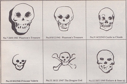
In that story, the Skull Mark took on the ultra-simplistic appearance and actually looked more like a ghost than a skull!
Barely a year later, in 1947, the Skull Mark appeared centered over crossed bones in The Dragon God adventure and this represented the 11th different design in 11 years.
By that time, original artist Ray Moore had retired and Wilson McCoy had taken over the art responsibilities for both the daily and Sunday stories.
Commencing with the 1949 story, Fathers and Sons, McCoy embarked on a curious series of even more design changes, but finally settled for a simple image.
In 1961, Sy Barry took over as the daily and Sunday artist. After introducing a completely new design in his first daily story, The Slave Market of Mucar, Sy actually twice modified the design in the same story and the third design was the most effective to that point. It was, amazingly, the 16th different design since 1936!

In the 1962-63 story, The Mysterious Ambassador, Sy finally worked up the near-perfect image, a simple white skull on a black background. That he changed to another design during the story was surprising, but the change lasted only a short time. In the 1976 story, The Stolen Ring, he returned to the white skull on a black background.
It was the 19th different design!
Small variations kept appearing up to Sy’s retirement in 1994. In his last artistic work, The Phantom Cowboy, in the same year, you can find at least two different designs.
However, the image was still essentially the same as the classic 1962-63 mark. Today, that basic design remains the norm.
The Good Mark
The Good Mark has followed a similar design path.
The First representation of the Good Mark appeared in the 1947-48 story, The Devil Road, but was not the Good Mark as we know it today. Far from it, in fact!
In that story, the character Connie, actually received the Skull Mark (as a sign of protection) on her palm.
In the 1950-51 story, The Phantom’s Ring, Bobby had a Skull Ring hung around his neck to indicate he was under the Phantom’s protection!
At that point, Lee Falk began to give thought to a completely different mark and the breakthrough occurred in the 1958 story, Carlyle’s Good Mark.
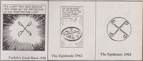
In that adventure, the recognized Good Mark design appeared for the first time and Connie Carlyle became the first person not to carry the Good Mark on her wrist, but on a necklace!
At that time, the P in the design faced left, but in the 1962 story, The Epidemic, the P in the design faced right, which is as we know the Good Mark today.
More changes followed the years to 1967, but all were light.

By 1971, we had seen three Good Mark ring designs and five Good Mark designs!
The one thing which has remained standard is that the Good Mark design represents crossed P‘s (for the Phantom).
Thank goodness for that continuity! It is probably right to claim that the Good Mark is more recognizable than the wide variety of Skull Mark emblems!
