The emergence of L’Espresso / Colore marked a pivotal shift in the Italian media landscape, functioning as a vibrant, high-gloss supplement to the influential weekly newsmagazine L’Espresso. Launched in 1965, this series was a strategic move by the Gruppo Editoriale L’Espresso, spearheaded by the visionary publisher Carlo Caracciolo and the legendary editor Arrigo Benedetti. While the parent magazine was primarily known for its austere, large-format newspaper style and its reputation for uncompromising investigative journalism, the Colore supplement was designed to capture the visual zeitgeist of a country undergoing a rapid economic and cultural transformation.
The publication was born out of a necessity to compete with the rising popularity of television and the glossy “rotocalco” magazines of the era, which favored photography over dense prose. By introducing Colore, the publishers were able to maintain their intellectual edge while embracing the aesthetic demands of the 1960s. It provided a canvas for a new kind of visual storytelling in Italy, blending the prestige of the L’Espresso brand with the allure of high-fidelity color printing. This hybrid approach allowed the magazine to reach a broader audience, appealing to both the politically engaged intellectual and the culturally curious citizen.
Inside its oversized pages, L’Espresso / Colore offered a sophisticated mix of content that mirrored the complexities of the “Italian Miracle”. It was particularly famous for its expansive photo essays, often sourced from prestigious agencies like Magnum, which brought global events into Italian living rooms with cinematic clarity. The editorial focus was diverse, ranging from deep-dives into social issues and international conflicts to intimate profiles of the icons of the era. It was not uncommon to find a gritty report on domestic labor strikes juxtaposed with a vibrant, avant-garde fashion spread or an interview with a towering figure of the French New Wave.
The aesthetic of the series was defined by its bold graphic design and minimalist typography, which allowed the photography to dominate the reader’s experience. The covers were especially iconic, featuring high-contrast portraits of cultural magnets like Sophia Loren or revolutionary figures like Che Guevara. This visual language helped define the “Made in Italy” brand of journalism—one that was as much about style and impact as it was about substance. The supplement became a gallery of the era’s most significant faces and moments, documented with a flair that pushed the boundaries of traditional magazine layouts.
The specific run of L’Espresso / Colore as a distinct, large-format supplement came to a close in 1974. At this time, the parent magazine underwent a radical “pocket-sized” transformation, adopting a smaller format that integrated color throughout its entire page count. This evolution effectively absorbed the spirit and the technical requirements of Colore into the main publication, ending the era of the specialized supplement. Today, the series remains a prized archive for historians and designers, serving as a lush visual record of a decade that redefined Italian society and its relationship with the image.
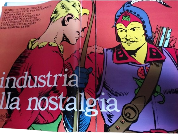
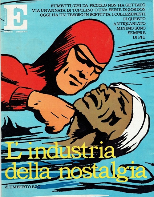
The Phantoms is found on the front cover of L’Espresso / Colore edition number 18 published on the 6th of May 1973. This edition is published with full color pages measuring 29cm x 26.5cm. Within this edition is an informative essay style article titled ‘L’industria Della Nostalgia’, which translates to ‘The Industry of Nostalgia’ written by Umberto Eco. The piece discusses how comic books represent a combination of languages, missing only actual sound effects while featuring visual ones.
The front cover features an image of the Phantom in his Italian red costume, an illustration by Ray Moore.
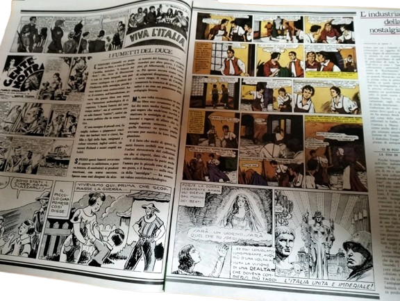
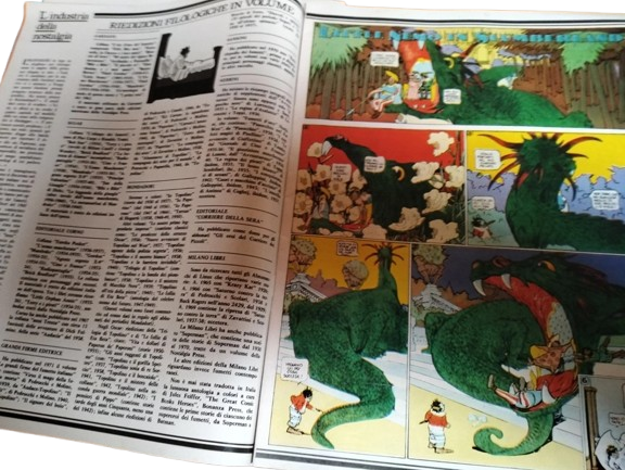
A sample of internal pages can be seen below.